
I was on the plane the other day and watched a clip of promotion video of Shanghai World Expo 2010 from the in-flight TV and was once again "thunder-bolted" by the bluesome mascot, dubbed lovingly as "Haibao", meaning "treasure of the ocean", coz "ocean" in Chinese pronounces as "Hai" which is the second part of the name Shanghai.
Shanghai government is said to have spent over 100 billion RMB, or 10 billion Euro / 15 billion USD on this event which is to Shanghai what Olympic 2008 is to Beijing. Yet I have hated the logo and the mascot since the first time I saw them.
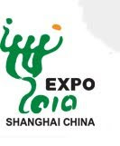
Let's start with the logo. The three greenish thick splashes with arms link together (the arms also extend out from both sides) looks somehow like the word "World" in Chinese writing, and I assume it means an union of people under this event. Yet the color and the way the word slumps reminds me of something particular. When I was a kid, once I put a frog into a small bottle filled with water and closed the cap. A few days later, I opened the bottle and poured out the contents: the frog was dead and flew out with the water - the effect was exactly - the World Expo 2010 logo.
So how about Haibao? It looks innocent enough. It looks pure and clean and reminds me really of a bar of jelly tooth-paste. The first time I saw it, and whenever I saw it afterwards, I think Colgate must be very happy with it. Actually, my biggest problem with Haibao is its painfully lack of imagination, if anything could bore anyone to death, Haitao bores me to death. I assume the creative rationale goes like this: let's take a drop of ocean water, which links to Shanghai by the "ocean" pronunciation as well as the geographic fact that Shanghai is a coastal city - and let's make the drop into a happy creature by adding two big eyes and a smiling mouth - and don't forget two little hands with one thumb up, perhaps with pointed-hair too!
Why can't we people make some creative mascot? Why can't we people make huge cartoon figures like the Japanese?
I tend to draw the conclusion that creative industry is the ultimate climax of economic development, and we're just not there yet. We're still at a time seeking and accumulating material wealth and we have a long way to go. But actually, it also hit me, when I'm stuck here, that beauty has not been a collective pursuit of our people, ever. There has not been any individual artist who attained the status like Da Vinci or Milelangelo in the West. Artistic pursuit, even affordable by the upper class, had been viewed as a self indulgence and even a kind of dissipation, almost negatively viewed with the moral mainstream. In fact, one of the emperor from the Song Dynasty, he himself a highly acclaimed painter of his time as well as centuries to come, was a big failure in his role as emperor and lost half of China to the Jin people from north. Bad example. If Confucius had been a preacher of beauty instead of a preacher of moral, we might have a better mascot now.

No comments:
Post a Comment